Web Design New Jersey: 10 Website Features NJ Customers Expect in 2026
Your website visitors in New Jersey aren't comparing your site to what was acceptable five years ago. They're comparing it to Amazon, their bank app, and whatever slick contractor site they saw on Google thirty seconds ago. The bar is higher than ever, and if your website doesn't meet these expectations, they're bouncing — usually within three seconds.
Here are the 10 non-negotiable features that NJ customers expect from your website in 2026 — and why professional web design in NJ isn't a luxury, it's a requirement.
What NJ Customers Expect from Your Website
New Jersey is one of the most connected, tech-savvy states in the country. Your customers — whether they're homeowners in Morristown looking for a roofer or business owners in Parsippany searching for an accountant — have zero patience for slow, clunky, outdated websites. They expect polish, speed, and instant access to the information they need.
1. Mobile-First Responsive Design
Over 65% of your traffic is coming from mobile devices. If your site doesn't look perfect on an iPhone, you're losing the majority of your potential customers before they even see your services. Responsive web design isn't a feature anymore — it's the foundation.
That means thumb-friendly navigation, properly sized buttons, readable text without pinching, and images that scale without breaking the layout. Test your site on your phone right now — if anything feels awkward, your customers feel it too.
2. Sub-3-Second Load Times
Google's data shows that 53% of mobile users abandon sites that take longer than 3 seconds to load. In New Jersey's competitive local markets, that's not just a usability issue — it's a revenue issue. Every second of delay costs you calls, form submissions, and bookings.
Fast sites rank higher, convert better, and create a better first impression. If you're running on cheap shared hosting with uncompressed images and bloated plugins, you're fighting with one hand tied behind your back.
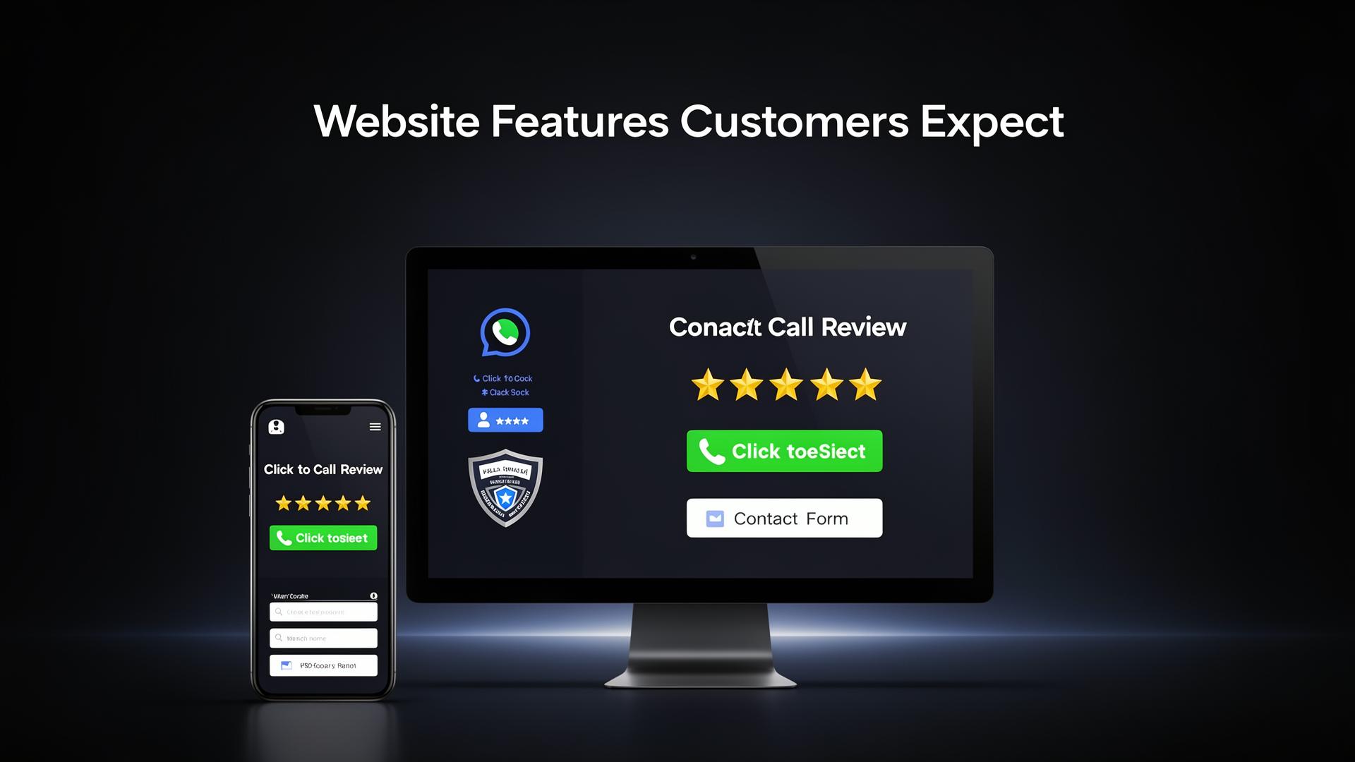
3. Click-to-Call Phone Number
New Jersey customers — especially ones searching on mobile — want to call you NOW. Your phone number should be visible in the header of every page, and it should be a clickable link on mobile. No hunting, no digging through menus, no 'Contact Us' page buried three clicks deep.
We put click-to-call buttons in the header and as sticky mobile elements on every site we build. When someone needs a plumber at 10 PM, they're tapping the first number they see.
4. Google Reviews & Social Proof
88% of consumers trust online reviews as much as personal recommendations. If you have 5-star Google reviews, they need to be front and center on your website — not hidden on a separate reviews page. Embed them. Feature them. Let your happy customers sell for you.
5. Clear Service Area Pages
NJ customers search locally — 'plumber in Roxbury,' 'roofer near Morristown,' 'HVAC in Denville.' If you don't have dedicated pages for each town and county you serve, you're invisible for those searches. Service area pages aren't just good for SEO — they tell customers 'yes, we serve YOUR area.'
6. SSL Security Certificate
If your website URL shows 'Not Secure' in the browser bar, you've already lost trust. SSL certificates (HTTPS) are table stakes in 2026. Google uses HTTPS as a ranking signal, and customers see that padlock icon as a basic sign that your business is legitimate.
7. Accessible Contact Forms
Not everyone wants to call. Many NJ customers prefer to fill out a quick form — especially for quotes, estimates, and appointment requests. Your contact form should be short (name, phone, email, message), visible on multiple pages, and send instant confirmation. Conversion rate optimization starts with making it effortless to reach you.
8. Professional Photography
Stock photos of people shaking hands in a conference room aren't fooling anyone. NJ customers want to see YOUR team, YOUR work, YOUR office. Real photos build real trust. If you're a contractor, show before-and-after projects. If you're a restaurant, show your actual food. Authenticity converts.
9. SEO-Optimized Content
Your website content needs to do double duty: it needs to read well for humans AND rank well on Google. That means proper heading structure, keyword-rich (but natural) copy, internal links between pages, and meta tags on every page. Content isn't filler — it's your #1 organic marketing asset.
10. ADA Accessibility Compliance
ADA compliance isn't just the right thing to do — it's increasingly a legal requirement. Websites need proper alt text on images, keyboard navigation support, sufficient color contrast, and screen reader compatibility. Beyond the legal angle, accessible sites serve more customers and often perform better in search.
Is Your Website Missing These Features?
If your website is missing even two or three of these features, you're leaving money on the table. Small business website design doesn't have to be complicated or expensive — but it does have to be strategic.
Randle Media builds websites that check every box on this list and more. We've built 200+ sites for NJ businesses, and we know exactly what it takes to turn visitors into leads. Call (973) 862-7867 or book a free strategy session to get started.
Written by
Chris Randle
Chris Randle is the founder of Randle Media, a digital marketing agency based in Ledgewood, NJ. With 200+ websites built and 6+ years of experience, Chris helps NJ businesses grow through web design, SEO, and digital advertising.
Learn more about ChrisReady to Grow Your Business?
Book a free strategy session or call us — no contracts, no pressure. Just a clear plan to get more leads.